Do you know the saying that there are no coincidences?
You know. Well, the story is that we've always liked Instagram. But despite the sympathy between us, there was not always time to think about what we publish, plan ahead and make it something that will have arms and legs. And it was nice, but without exaggeration, because it was mish ma, and ...
Harmony is the friend of beauty.
And we love beauty! I need to tell you one more non-secret that all my friends know about: I'm a terrible perfectionist. And this cehca of character told me:
Hi! You Can Do It Better!
And what! I won't ?!
For some time now, we have been receiving very nice signals from you that you like our instagram. And here we go back to the beginning - there are no cases. It doesn't self, we are working on it :) We would like to show you today what our principles are, because we believe that if you want, you can do it even better :)
INSPIRATION
It starts with a photo, picture or newspaper article that will inspire us in terms of colors. It is about a color palette that "talks" to us. We love bright and clean colors, but for you it can be moss, fern and fog thick as milk. At the sight of what climate do you feel that your heart beats faster, or that joy or longing appears in you? In a word, when do you feel SOMETHING? Collect such inspiration! They will guide you further.
I smiled :)
ANALYSIS
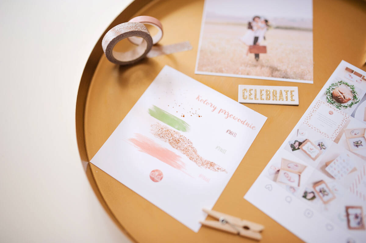
We take such a photo and we wonder what color palette is dominant? Which of them do we want to use? For me, the basis is always white, gray or cream - for this I choose complementary colors. You can upload a photo to photoshop and use a pipette to pick up the colors that suit you. Note: excluding neutral colors, I try to choose 2 or 3 complementary colors. No more, because it gets mish-ma, and (see above), we are looking for harmony.
These are our guiding colors (along with color codes)
Do you know where to find the color code? - you choose the brush tool in PS - with the "alt" button pressed, click on the color you want to find - you open the color menu and there you will find the code (marked in blue in the picture)
CHOICE OF ACCESSORIES AND PHOTOS
Once I know what my leading colors are, I try to be consistent. Contrary to appearances, this is the most difficult stage for me, because there are often SO MANY things that I want to show and I have to give it up or postpone it .. But it's really worth it, because thanks to this we get beautifully arranged photos! It often happens that I already have photos ready that match the guiding colors. In addition, I am looking for additional accessories in a given color scheme and I am taking new photos. Here I was looking for spring green, gold slightly copper-clinging, brown cardboard or leather, and powder pink. The point is not to run to the store and rob a interior design store, but to bring out beauty from everyday objects :)
Ribbons from a private drawer with "dappers" and a tray from JYSK - these are my home accessories for this photo
Thanks to this dedication (temporarily rejecting other photos and color consistency), we have a beautiful board on instagram :)
POST PLANNING
Instagram posts aren't just about photos. They can be intertwined with quotes, tips, customer opinions .. Has anyone recently told you something nice about your work? Show it off! I also try to keep an eye on the so-called checkerboard layout - i.e. I interweave darker photos with lighter ones (so that they are not adjacent to each other vertically or horizontally). Thanks to this, the whole system remains light and consistent. The chessboard isn't the only great hand. Watch your favorite profiles (we'll give you a few of them at the end) and you will surely find others (e.g. three)
Our instagram in the "greening" phase
USEFUL APPS
Applications are useful for planning and "predicting" the appearance of Instagram. You can then see how the photos will look next to each other, or maybe it's better to separate them with others. They will also help you plan posts, because most of them can be automatically published on Instagram company accounts (private ones need to be confirmed on the phone). We recommend: Planoly Later Color Story (which is also an advanced photo editor)
All of them in the basic version are free, so .. no excuses :) Come on!
FINAL REMARKS
I encourage you to treat Instagram like fun :) To schedule regular posts for two weeks, one afternoon is enough. Really :)
I would also like to thank my "helpers", Bezie, who helped me effectively, stealing my teaching aids every now and then, to create this post :) However, she was understanding enough that we managed to finish :)
I would also like to leave you some inspiring profiles (in no particular order):
https://www.instagram.com/mrsostrovia/?hl=pl
https://www.instagram.com/ajem_stories/
https://www.instagram.com/gypsea_lust/?hl=pl
https://www.instagram.com/monikaserekphotography/?hl=pl
https://www.instagram.com/martidamska/?hl=pl
https://www.instagram.com/magdalenamizerafotografia/?hl=pl
